Mathematics Developmental Continuum

Students can produce summary statistics and graphical displays for given data sets. They are able to critically evaluate graphical displays and summary statistics. Evidence for this is when students can recognise misleading presentations of data.
Prior to this, students may have difficulty in identifying features of graphs or summary statistics that are misleading.
Students will have developed skills at producing graphs and summary statistics both by hand and using appropriate technology. They now need to consider prepared graphs and summary statistics and identify when samples might be biased; the effect of outliers on summary statistics and inappropriately labelled or scaled axes. Students need to be able to read commercial publications and understand limitations of statistical evidence.
One of the aims of school mathematics is to produce citizens with statistical literacy. As well as being able to conduct their own statistical investigations, students need to develop critical skills to evaluate the material that they may read.
Activity 1: Misleading graphical displays raises awareness of common ways in which graphical displays can be manipulated to tell the story that the writer wishes to portray.
Activity 2: Misleading displays in the news examines misleading displays in the media.
Activity 3: Misleading summary statistics in the news examines misleading or incorrect uses of summary statistics and of sampling procedures.
For activities 2 and 3, students may also be encouraged to collect their own examples.
This activity is intended to help students identify misleading representations of data. For example, axes may be scaled to make two groups appear close or distant. Students need to develop the ability to be critical readers of graphs.
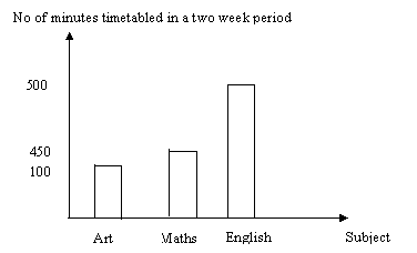
The following graph displays the time allocated for Maths, Art and English each two weeks in a school. Students could be asked to explain what the graph shows, what might be the purpose of the graph and why it is misleading. They might also be requested to redraw the graph so that the graph is a fair representation of the situation, or alternatively to manipulate a graphical display to tell a false story.
 |
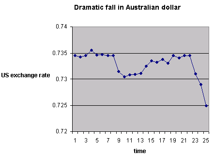
In the example below the vertical axis does not start at zero and the resulting graph suggests a huge decrease in the Australian dollar. Students could discuss why the graph has been presented in this way and note how the title of the graph is also used to persuade the reader that the drop in the Australian dollar is dramatic.
 |
This activity encourages students to explore misleading graphical displays in the media.
Find an article in a local newspaper where a graphical display is chosen to favour a particular viewpoint.
Possible examples are:
Have a class discussion about how the graphical display could be misleading. It is important to discuss particular features of graphs and why they are misleading. Students should consider scale, labels of axes, etc. in relation to the questions being addressed and the interpretation placed on the graph.
Possible areas for discussion could include:
This activity encourages students to explore misleading summary statistics and poor reporting of samples and sampling in the media.
Find an article in a newspaper where summary statistics are presented to favour a particular viewpoint or where the samples and sampling processes are unclear.
Possible examples are:
Have a class discussion about how the findings could be misleading or wrong.
Possible areas for discussion could include: