Mathematics Developmental Continuum

Students will be able to choose an appropriate graphical display for data and give reasons for their choice.
Prior to this, students will be able to construct graphs of specified types (by hand or with technology), but have difficulty selecting the graph type and explaining why a particular type is appropriate for displaying the data.
Students may only have experience producing specified graphs for data sets. Often the type of graph to be produced is indicated by the teacher or given in the activity. So students may not have been encouraged to consider the appropriateness of different graphical presentations.
The challenge here is to move the focus from producing a specified type of graphical display to choosing an appropriate graphical display for a given data set. Students need to develop the ability to choose graphical displays wisely and to recognise when a type of graph may or may not be helpful to describe a data set.
The teaching challenge here is to develop students' ability to choose and use mathematical tools to best advantage. This is difficult for students and needs nurturing. This ability builds on the skills of creating graphical displays, but it needs nurturing through activities where students have to make their own choices and justify them.
Activity 1: Comparing Graphical Displays is an
awareness raising activity. By using prepared graphs, the lesson is able to
focus strongly on the strengths and weaknesses of the graphs.
Activity
2: Choosing Appropriate Graphical Displays enables students to
practise selecting appropriate graphs through an open task using data from
their own school. Deliberately, students are required to select the best
graphical display to answer a question, rather than being told what to use.
Activity
3: Graphical displays as a part of statistical investigation is
here as a reminder that it is important at every level that students should
experience the complete process of statistical investigation.
The main purpose of this activity is to help students to recognise the need to make careful choices about representation of data.
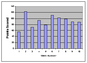
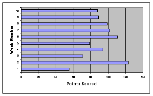
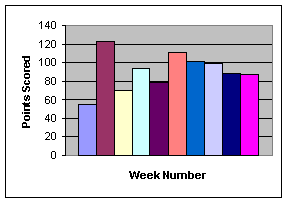
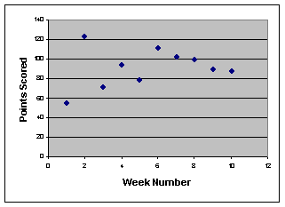
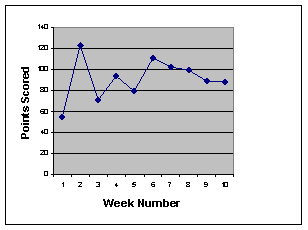
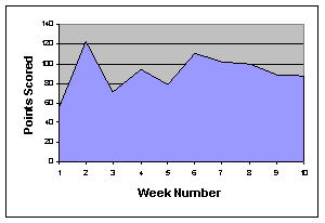
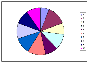
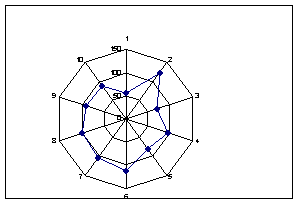
Provide students with a range of graphs (such as those below) that display the same data: in this case the points scored by a football team over ten weeks. Have students consider a range of graphical displays and give reasons why particular graphs might or might not be helpful to answer a question about this data set. Some of these spreadsheet charts may look unusual (e.g. Chart H), but students often find them on the spreadsheet program and use them, appropriately or inappropriately.
|
A |
B |
|
|
C |
D |
|
|
E |
F |
|
|
G |
H |
Some points for discussion
The various column graphs in A, B and C are all appropriate, although they highlight different features. Chart B emphasises that only in week 2 did the score exceed 120 points. Chart B does not show the trend through the season as well as Charts A and C. Colour could be used in Chart C to show another variable (e.g. home and away games or wins and losses).
In Chart E, a line has joined the basic scatter plot shown in Chart D. This line assists visually in making sense of the data. The filling below the line in Chart F does not add information in this context. It actually distracts from the focus on the weekly scores. The filled area under the line does represent the total number of points for the season, and so charts like this are often used to show how a quantity is accumulating (e.g. profits of a company)
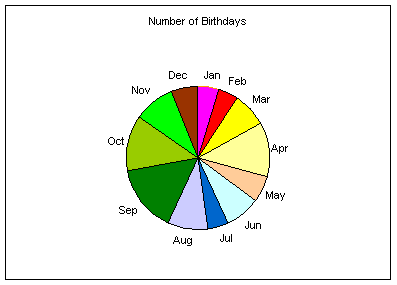
The pie chart of Chart G shows how the scores of each week contribute to the total number of points gained in the season. However, this is not a good chart for showing the scores, or for seeing the trends. Chart H is more appropriate in this context. Such charts are excellent for showing cyclic phenomena. For example, if a standard bar chart is drawn for the average temperature in a city, then January will be on one end and December on the other end seemingly unrelated, but Chart H makes them adjacent.
This activity requires students to choose appropriate graphical displays to answer different questions about a data set. Teachers should ensure that both categorical and numerical data are used, because they are graphed differently.
Note: these words will not be used by students at this level, but in teachers' professional discussions.
Numerical data is anything where the answer is a number, and the size of the number is important (e.g. how many children do you have?). Categorical data is anything where the answer is one of a set of categories (e.g. what type of car do you drive, where were you born).
Preparation
Give each student a card on which to answer a short survey about themselves. The resulting data set can be used on many occasions. Sample questions will include both categorical and numerical data such as:
Tabulate the data with students' help.
Focus on appropriate graphical displays
| Have students pose questions about the data set, and then produce appropriate graphical displays which will assist in answering the questions posed. Have students write about why they chose their graphical displays. Hold a class discussion on these choices. |
|
|
Sample response: I chose to show the Grade 6 birthday months with a pie
chart, because it clearly shows that in our grade, January 05, 2019 |